Impressive use of 3D projection mapping - no SFX, post production, or cuts, this was all done in one take.
In the past, projection mapping worked only from a single, static view point, and thus was very limited. By attaching the PlayStation Move to the camera, projections can be tracked to screens in real time, enhancing the effect of spatial deformation and false perspective on the projections and allowing viewers to look round (virtual) corners, bend walls, create a hole in the wall, or remove the walls altogether to reveal vast expanses of virtual worlds.
Visitors at the The Exhibit Bar in Balham can play one of three games every time they use a urinal. The video game has been trialled in a bar in Cambridge since mid-July and it has proved to be both popular and profitable.
One of the game’s co-founders, Gordon MacSween, was not sure how the public would react to the game initially. But as soon he saw the game on trial at a bar in Cambridge he knew he was on to something good. The game was designed to create a valuable media opportunity from the 55 seconds the average male spends while he pees just staring at a blank wall.
Augmented reality (AR) is a fun technology that overlays digital media onto the physical world. Modern mobile devices like iPhones and Android phones are loaded with sensors like GPS, accelerometers and cameras that make AR possible. In this project we will augment the cover of MAKE magazine with a digital image and link it to a video on the web. To accomplish this, we'll learn the basics of the Layar AR platform, design a simple AR layer, and develop a very basic web service to deliver the AR layer to your smartphone.
Fantastic how-to article about creating an augmented reality magazine cover is here via BoingBoing
Eye Asteroids is the first eye-controlled arcade game, created by Tobii, a company that develops eye-tracking tech. Debuting at New York's Dave & Buster's arcade this week, the game has just one button, and you only press it once to start. Once you do, the game uses a strip of infrared sensors below the screen to scan your eyes and calibrate the system. The Earth stands in the middle of the screen, all you have to do is look at an incoming asteroid, pause slightly to shoot and move on to the next target. You can watch the video of it in action. Each machine costs a reported $15,000, and there will only be 50 made.
Sure, the video is ridiculously terrible. Sure, it got absolutely slated online but this was mostly by the industry, and mostly on Twitter to a predominantly UK audience - which is unfortunate given the video was not correctly credited and clearly was not produced by the Sapient UK office.
As an agency Sapient aren't mental, they didn't lose their minds, this was an innocent PR stunt from an award winning agency that was misread by its audience. Sapient could have easily allowed the negative commentary to flow freely and positioned the video as a tongue-in-cheek promo piece that was not meant to be taken too seriously (which is exactly what it is). If they had done that then they would have benefitted from trending on Twitter and looking like an agency that has no qualms with poking a bit of fun at themselves.
However, as soon as they started heavily moderating negative comments on Facebook and Youtube, they created a beast. The backlash was so strong that they were backed further and further into a corner (negative comments were pulled within a minute of being posted and the conversation swiftly moved from the moderated Facebook and Youtube pages to the unmoderated Twitter where it soon trended) until they resorted to pulling the video offline altogether.
In terms of damage control this was already far too late and Youtube account HelloYouCreatives had already ripped the video and put it back online for the benefit of referencing it in articles and enabling free commentary. As quoted from their blog, "we've re-hosted it as we believe that people should be free to comment."
Meanwhile, a twitter account has been set up as a way of trying to limit the damage and open a conversation. But this was too late in terms of people already viewing, posting their comments, and then watching them being deleted, and then reposting negative feedback about a brand that was ineffectively trying to control the freedom of speech online.
As poor as the video effort is, what is totally shocking is the complete incompetency and naivety with which Sapient Nitro handled the resulting commentary. As soon as they decided to moderate negative comments, they were doomed. Why was this not accelerated up the ranks to an experienced staff member who knew how to handle things? You cannot create a video about a digital agency and then expect to try and control feedback from the digital industry. Furthermore, you cannot push anything into a social space and then control the commentary on it - there is no longer a conversation and deleting comments has the same effect as shouting at everyone until they stop talking in ways you don't like.
An absolutely schoolboy error from Sapient Nitro, and an incredibly unfortunate one given that the activity of one branch of a global agency represents the agency as a whole. They're going to have to work hard to pull themselves out of this funk and it's a lesson to all global agencies to connect their online presence in a lot tighter and more reactionary way.
Microsoft's .NET technology concept video from 1999. See if you can spot the ideas that begat Windows Mobile, MSN Explorer, Tablet PC, Games for Windows and more.
Video games are important. They are a storytelling medium, a place for self-expression, a sandbox for the human imagination, and an extension of an ages old tradition of gaming. We play out some of the most essential aspects of our culture in games, and we learn more about ourselves and the world around us in the process. From the powerful cinematic experiences of mainstream gaming, to the hyper-personal environments of indie games, we are in the midst of an explosion of gaming activity that, as some predict, will continue to define the way we live and interact with information, and each other, far into the future.
In a friendly, high-speed presentation, Will Wright demos his newest game, Spore, which promises to dazzle users even more than his previous masterpieces.
Blindside is a video game with no graphics, played entirely using audio. It is an audio adventure, set in a fully 3D world that you’ll never see.
This is not a social game, this is not an MMO, this is not a game designed to make money. This is a game designed to be fun, to be hard, and to push the boundaries of what players expect video games to be. This is a game designed to challenge us the way Zork and Super Mario Brothers have. This is a game designed to reward those who persist and overcome it, the way you might have felt after completing The Dig or Half-Life. But most of all, this is a game designed to thrill its players in brand new ways.
Chad Vavra, interaction design director at The Barbarian Group, rounds up 10 key rules that make good interaction designs and designers and that you need to understand before you can break them.
"As we all perfectly know, designers are narcissists; programmers are nerds, and whoever wears a tie must be a clueless jerk. Designers, programmers and business people love to hate each other. That’s why we keep them separated"
Sci-fi doesn't imagine computers like the one you're probably staring at right now, it imagines them looking like the one we might see next week. Here is a tour of great tablets and even greater interfaces.
Pretty good statement about the seemingly endless flood of infographics that have been churned out in the past few years. I would have to agree that the production mentality behind infographics has started to slip from being about displaying informative facts in a visual way to "here's any old facts and figures just because I can and I reckon it looks good".
If you've ever played video games then you'll know that there are two different ways to look around. The "classic" setup where pressing up on the control pad makes you look up, and pressing down makes you look down. Then you can also invert these controls and this image neatly explains the logic behind it.
Really interesting article on the rise of Angry Birds and just why it's so successful and popular.
Simple yet engaging interaction concept: This seems an obvious point, but few realize that a simple interaction model need not be, and rarely is, procedurally simple. Simplification means once users have a relatively brief period of experience with the software, their mental model of how the interface behaves is well formed and fully embedded. This is known technically as schema formation. In truly great user interfaces, this critical bit of skill acquisition takes place during a specific use cycle known as the First User Experience or FUE. When users are able to construct a robust schema quickly, they routinely rate the user interface as “simple”. However, simple does not equal engaging. It is possible to create a user interface solution that is initially perceived by users as simple. However, the challenge is to create a desire by users to continue interaction with a system over time, what we call user “engagement”.
Several people who are attending the 2011 Accessibility Summit pointed out that traffic lights aren't, traditionally, accessible. If you're colourblind, does red, yellow, green tell you as much information as you need, as easily and quickly as you need to know it?
Turns out, some Canadian provinces deal with this by adding shapes to the lights, as well as colours.
This video is pure gold. The description says it all really - "THEY SHOULD HAVE ENHANCED THE MATRIX DATAFRAME AND ZOOMED IN ON THE GUI UNIT BINARY FORM IMO"
National Geographic has a look at where and how we live:
The map shows population density; the brightest points are the highest densities. Each country is colored according to its average annual gross national income per capita, using categories established by the World Bank (see key below). Some nations — like economic powerhouses China and India — have an especially wide range of incomes. But as the two most populous countries, both are lower middle class when income is averaged per capita.
Really fantastic collection of interactive devices.
Over the past 30 years, designer, writer, and researcher Bill Buxton has been collecting input and interactive devices whose design struck him as interesting, useful, or important. In the process, he has assembled a good collection of the history of pen computing, pointing devices, touch technologies, as well as an illustration of the nature of how new technologies emerge.
This is incredible technology from Wacom. Simply put: you can draw onto a piece of paper and Inkling will turn that drawing into a digital file. Absolutely amazing.
As mentioned in a previous post, I have something of a soft spot for movie GUI's and am fascinated by their creation. So, I was more than happy to be recommended this cracking article by a friend.
The article opens: We had a quick chat with Alien creator Dan O'Bannon and found out just how much CGI there is - and isn't - in the original episode IV...
And without wanting to simply reiterate what has already been written very eloquently, here is the link to the article over at Den of Geek!
Absolutely mind-blowing description of how the effects for the movie Tron: Legacy were created by JT Nimoy. He writes:
I spent a half year writing software art to generate special effects for Tron Legacy, working at Digital Domain with Bradley "GMUNK" Munkowitz, Jake Sargeant, and David "dlew" Lewandowski. This page has taken a long time to be published because I've had to await clearance. A lot of my team's work was done using Adobe software and Cinema 4D. The rest of it got written in C++ using OpenFrameworks and wxWidgets, the way I've always done it with this team ;) Uniquely however, Digital Domain's CG artists were able to port my apps over to Houdini for further evolution and better rendering than OpenGL could ever provide. Special thanks to Andy King for showing me that what seasoned CG artists do at DD is actually not so far off from what's going on in the Processing community.
An utterly fantastic video from 1966 that speculates on what life will be like in 1999. Unlike most videos from the past that speculated on flying cars and robots doing all our chores, this one went for the 'home shopping' angle, bank account unification and a way to send letters electronically all over the world.
Aaaaah, they just don't make them like they used to. (I mean both the tv show and the video games)
From the TV video games show BAD INFLUENCE! aired in 1992. The panel review Max on Gameboy and Roadrunner on the SNES. For more go to bad-influence.co.uk
How do you describe planetary and star size to someone? I love this video for succeeding in showing the viewer the mega-scales and proportions that exist in space.
Another awesome realisation of the near future from the Australian Commonwealth Bank.
Delivering customer satisfaction beyond 2010 requires us to drive change and continually innovate beyond what the market dictates or our customers expect. Innovating through the digital platform is one way we can make this happen.
Looking to the next 3 years, the key trends we see shaping banking digital innovation are;
Customisation: Enabling our customers to have a personalised experience with the bank
Continuously connected: Providing immediacy and allowing our customers to access the bank and their financial information in real time
Cross platform functionality: Allowing our customers to access & move information across any digital device
Centralised financial management: Giving our customers to access all their financial information in one place
Community: Connecting our customers and facilitating the exchange of experience and advice
This video piece showcases a series of scenarios that showcases how we, as one of Australia's leading banks, can bring these to life and give our customers an experience and level of service that exceeds all expectations.
The architecture of the contemporary city is no longer simply about the physical space of buildings and landscape, more and more it is about the synthetic spaces created by the digital information that we collect, consume and organise; an immersive interface may become as much part of the world we inhabit as the buildings around us.
Augmented Reality (AR) is an emerging technology defined by its ability to overlay physical space with information. It is part of a paradigm shift that succeeds Virtual Reality; instead of disembodied occupation of virtual worlds, the physical and virtual are seen together as a contiguous, layered and dynamic whole. It may lead to a world where media is indistinguishable from 'reality'. The spatial organisation of data has important implications for architecture, as we re-evaluate the city as an immersive human-computer interface.
Very dark user experience noted by James Chudley on the Starbucks wifi connect form. As a user you can only access the wifi if you agree to the Starbucks T's & C's which also includes agreeing to be sent junk mail by BT! Sneaky...
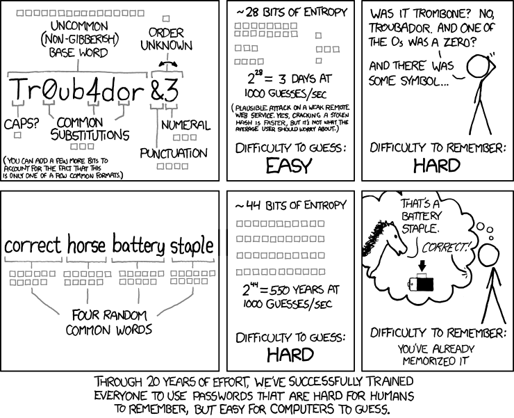
"Through 20 years of effort, we've successfully trained everyone to use passwords that are hard for humans to remember, but easy for computers to guess."
Erik's fantastic blog showcases and celebrates the toys and games Nintendo created in the period from the mid 60s to the early 80s, starting with the first board games up to the launch of the Family Computer in 1983.
Do you want to find out more about what Nintendo was up to before Mario? Then please read on.
Great article on the poor usability of restaurant websites
The first thing that pops up when you visit the website of the San Francisco restaurant Fleur de Lys is a nearly full-screen animation of celebrity chef Hubert Keller's autograph. That makes sense—when I'm choosing a restaurant, the first thing I want to know is, Can the chef sign his name?
The Very Large Telescope (VLT) in an array of four telescopes operated by European Southern Observatory, and together the array "can achieve an angular resolution of around 1 milliarcsecond, meaning it could distinguish the gap between the headlights of a car located on the Moon."
Aaron Koblin, Creative Director of Google's Data Arts team, shares some of the many projects that he's worked on his recent TED talk (video below).
An interface can be a powerful narrative device, and as we collect more personally and socially relevant data, we have an opportunity and maybe even an obligation to maintain a humanity and tell some amazing stories as we explore and collaborate together.
Jose Duarte, a graphic designer, has lately been presenting information using physical objects. These balloons, for example, represent the number of Internet users in (from left to right) China, the EU, India, Brazil, Mexico, and Portugal.
If you have ever had the misfortune of encountering an automated telephone menu then you will already know exactly how terrible the user experience is on these things.
If you haven't here's how they work: rather than talking to a real person you are played a recording of a person introducing the service you have just called up (the recording has been edited and compressed so much that it sounds like a robot voice). The user is expected to select their options by timing their response precisely and pitched perfectly. The voice recognition software is often incredibly flawed at best, and the resulting user experience is enough to put you off ever using that service again.
This brilliant recording demonstrates just how frustrating automated telephone menus can be:
A fantastic parody of an automated telephone menu is here by the Fonejacker:
Animation that visualises the internet as a real place with all sorts of happenings and goings on. Quite a few people have tried to explain the online experience as more than viewing a series of interconnected pages, and I would say that this is one of the few that gets close to what the experience is like (for some at least).
Fantastic new smart phone interface means that rather than pinching the screen to zoom in, you just have to move it closer to your face in order to get the same effect. Simple user interaction smoothly executed.
Instead of the traditional pinch-to-zoom, resting two fingers atop the screen will allow you to zoom in by bringing the S II closer to your face or zoom out by holding it further away -- a naturalistic gesture that makes all the sense in the world to us. Moreover, when adding new widgets to your home panels, you'll be able to move between them by propelling the phone laterally.
Rapp recommends that menus be laid out in neat columns with unfussy fonts. The way prices are listed is very important. “This is the No. 1 thing that most restaurants get wrong,” he explains. “If all the prices are aligned on the right, then I can look down the list and order the cheapest thing.” It’s better to have the digits and dollar signs discreetly tagged on at the end of each food description. That way, the customer’s appetite for honey-glazed pork will be whetted before he sees its cost.
Also important is placement. On the basis of his own research and existing studies of how people read, Rapp says the most valuable real estate on a two-panel menu (one that opens like a magazine) is the upper-right-hand corner. That area, he says, should be reserved for more profitable dishes since it is the best place to catch–and retain–the reader’s gaze.
Cheap, popular staples–like a grilled-chicken sandwich or a burger–should be harder to locate. Rapp likes to make the customer read through a mouthwatering description of seared ahi tuna before he finds them. “This is akin to the grocery store putting the milk in the back,” he says. “You have to walk by all sorts of tempting, high-priced items to get to it.”
The adjectives lavished on a dish can be as important as the names of the ingredients. What would you rather eat, plain grilled chicken or flame-broiled chicken with a garlic rub? Scrambled eggs or farm-fresh eggs scrambled in butter? “Think ‘flavors and tastes,’” Rapp says, repeating a favorite mantra. “Words like crunchy and spicy give the customer a better idea of what something will be like.” Longer, effusive descriptions should be reserved for signature items.
The eye movements of 11 people watching P.T. Anderson’s There Will Be Blood are tracked using Eyelink 1000 in order to gain a better understanding of how movies are experienced.
"User Experience can mean many things to many people, but we all agree that the end result is happy users. Unfortunately a lot of people feel that UX begins and ends with their site or app. Disney World illustrates that true UX starts way before someone hits your site and long after they become a customer."


