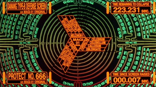
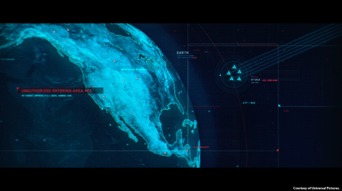
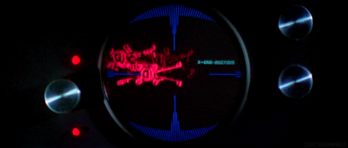
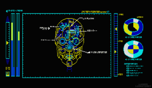
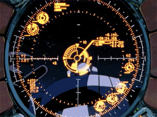
Now, I have to admit I have have something of a penchant for sci-fi movies and always become distracted the plot and often jealous of the cool interfaces the characters in these movies get to use. So you'll understand that I was pretty excited when I stumbled across a tumblr created by a Czech person (I don't know who they are, very mysterious) who shares this interest in futuristic graphical user interfaces and has gone through the trouble of collecting the best examples and turning them into gifs. I've shown my favourites from the collection below:
Check out the whole of this awesome collection over at Visual Punker
What does it mean for online content to “go viral”? An analysis of almost a billion information cascades on Twitter news, videos, and photos has produced the first quantitative notion of whether something has indeed gone viral, thereby enabling further research into topic experts, trending topics, and viral-incident metrics.
We live in the era of Big Data. Never in modern human history have companies and individuals had more (and more complex and reliable) numbers, statistics, and metrics at their disposal: from box scores to earnings reports to housing prices to placement-test results, we are at sea in an ocean of numbers and awash in spreadsheets. As artificial-intelligence pioneer Kris Hammond explains in this film, the great challenge in the Big Data era is understanding the stories those numbers tell and, just as important, connecting the right people with the right stories.
“This is what Hammond and his company, Narrative Science, do: create fluidly written, micro-targeted news stories from massive amounts of raw data—and do it hundreds of thousands of times, and slightly differently for each reader or listener. The recipient could be a fast-food franchisee seeking to understand what menu item sells best at what moment of the day, at what time of year, even in what weather, so he can optimize point-of-sale strategies. “
“Our entire job,” says Hammond, “is to humanize data. It is to be a communication bridge between the numbers and the knowing.”
The Bloomberg Terminal is an integrated computer system and service feed offering real-time financial data and trading. It has made its inventor a billionaire, and users often go for a multiscreen setup. So, it works but it is also incredibly ugly. So, why not redesign this clunky GUI?
Simplifying the interface of the terminal would not be accepted by most users because, as ethnographic studies show, they take pride on manipulating Bloomberg’s current “complex” interface. The pain inflicted by blatant UI flaws such as black background color and yellow and orange text is strangely transformed into the rewarding experience of feeling and looking like a hard-core professional.
The more painful the UI is, the more satisfied these users are.
The Bloomberg Terminal interface looks terrible, but it allows traders and other users to pretend you need to be experienced and knowledgeable to use it.
Virtuix have developed the Omni, an omnidirectional treadmill controller for virtual environments. Virtuix is aiming to launch a Kickstarter campaign for the Omni around the end of May or the beginning of June, and it's targeting a price of $400-600 for the device. Very cool immersive experience but as any gamer knows, the ability to crouch in a FPS is crucial..
Gangnam Style became world famous for its South Korean creator Psy's extreme electro-pop soundtrack, neon stylings and novel dance moves. What really made me take notice was the fact that it was the first YouTube video to top 1 BILLION views (currently at 1.5 billion at time of writing). A billion views is an almost unfathomable number but this video has (amongst many other things such as paving the way to creating mega-viral content) provided a benchmark in 21st century history for us to look back and remember the age when people who were online were collectively consuming the same content in near real-time.
Psy's new video called 'Gentleman' is another noticeable piece of online content since it has managed to secure 60 MILLION views in 2 DAYS purely because it is the next piece of content to come from Psy. 60 million views in 2 days is a ridiculous statistic and one that is often overlooked in articles elsewhere given its predecessor's success. 60 million in 2 days is mega-viral. But it will become a perfectly normal figure within the next 6 months. The rate at which content can go viral and then mega-viral is increasing as networks of people are able to share content faster and faster. Ultimately there will be a point in time where there will be one channel online, the mainstream, that plays the most viral piece of content for that day / hour / minute. We can already see the first steps of this in Twitter's #hashtag trending list.
The content delivery model is still based on the old-school method of users being fed the latest information from an authoritative source. People currently look to content-hub websites (Reddit, Buzzfeed, news websites etc) or to tastemakers for what's hot since they are considered the authority on what should be watched right now. Incredibly, some mega-memes like the Harlem Shake have even been jumped on as a direct way to make money for the man.
However that is changing as online social groups are becoming more fragmented and specialist. The opinion of a known friend is more valuable than an entertainment source and online social groups are now evolving their own tastemakers, those who are always posting the latest videos in their feeds - we all know one person like that. The fact that they still look to get their content from entertainment sources is irrelevant. What is relevant is that there is now someone, a real person, a trusted person who is filtering this content and then sharing the stuff that they think you'd like.
This TED Talk from Kevin Allocca neatly explains “Why videos go viral”. Put simply, anything new that consists of the magic three ingredients will go viral: to gain recognition it must be noticed and promoted by a select few people (tastemakers) with a large number of followers, then it must allow anyone to participate creatively in their own way, and lastly it must have complete unexpectedness.
Although that video describes how how quickly the music charts can change based what’s popular with online communities, it is also listing the founding pieces of content that were around at the time that people started to all tune into the same content together. The ancestors of mega-memes.
Very soon there will be a very strong sense of community online as a whole, and it will become comforting to all be online together, all consuming the latest content together. This will reflect humanity online; what people currently find funny, sad, interesting, shocking, and so on. This already exists but it's in various places and is very disparate - to say the Twitter community, or the Reddit community, or the Guardian online community who comment on articles is representative of humanity online is incorrect. Those are still relatively small groups of people who have been drawn together by a common interest. What still needs to happen is for people to come completely together online in one place. This is essentially a hive mind and in its early stages is one that is only used for watching Gangnam Style, but imagine a future with the power of that many people all focussing on the same thing together at the same moment in time. It'll happen once the platform for it is available, and when it does it will dwarf everything else that came before it.
How do you enhance the driving experience of a popular car brand in a highly competitive market? By considering an often overlooked but integral element of the user experience, the sound design of the product.
At BMW it has become such an exact science that 14 sound artists work on creating sounds that are functional and yet pleasent to the ear.
As one of the sound artists says, "a car needs the right soundtrack for maximum driving pleasure" and he's got a point - not only do the sounds a car makes need to be of a high quality, but also the unwanted sounds need to be removed. I've often thought this after stepping out of a nice car and enjoying the clunk of the door closing - automotive sound design is very similar to user experience design for the web in the sense that if it's done right then it's pleasantly ambient.
Excellent map animation from Oliver O’Brien that visualises the touch ins and outs of Oyster cards, London's travel cards. Originally created for the “Sense and the City” exhibition at the London Transport Museum, which ran from Summer 2011 to Spring 2012, this animation powerfully illustrates the flow of London's population towards its centre as people commute in to work.
The in/out numbers are for each 10-minute interval. For stations where the in/out numbers are roughly equal at that time, the colour is white. Red stations indicate a strong flow into the network and green stations show a predominately outward flow. The Oyster card data was supplied by Transport for London and a version of this animation was created and shown at the London Transport Museum during its "Sense and the City" exhibition in 2011/2. The video here is a screen capture of a OpenLayers map which was produced by me at UCL CASA for the exhibition. The background map is based on data from Ordnance Survey Open Data (Crown Copyright) and OpenStreetMap contributors (ODbL). Background imagery created using Mapnik.
Interesting 'infographic' from Erik Flowers on the common misconception that being classed as a User Experience Designer can be incorrectly understood as someone who focusses just on user interface design. The interface is not the solution and a good user experience does not stem directly from a good user interface, there are many more factors involved (as illustrated below).
The Anthropocene = "A period marked by a regime change in the activity of industrial societies which began at the turn of the nineteenth century and which has caused global disruptions in the Earth System on a scale unprecedented in human history: climate change, biodiversity loss, pollution of the sea, land and air, resources depredation, land cover denudation, radical transformation of the ecumene, among others. These changes command a major realignment of our consciousness and worldviews, and call for different ways to inhabit the Earth."
This video is an illustration of map experiments that demonstrate the Anthtopocene, and it shows several features of our global civilization: cities, built environment, transmission lines, pipelines, main paved and unpaved roads and railways.
This is essentially really intense mapping, but once you've got your head around the rather weighty text introduction (after the link), the true scale and meaning behind it will blow your mind.
If you have ever had the misfortune of encountering an automated telephone menu then you will already know exactly how terrible the user experience is on these things.
If you haven't here's how they work: rather than talking to a real person you are played a recording of a person introducing the service you have just called up (the recording has been edited and compressed so much that it sounds like a robot voice). The user is expected to select their options by timing their response precisely and pitched perfectly. The voice recognition software is often incredibly flawed at best, and the resulting user experience is enough to put you off ever
This brilliant recording demonstrates just how frustrating automated telephone menus can be:
A fantastic parody of an automated telephone menu is here by the Fonejacker:
Creating yet another password for yet another new website is already a years old problem. Most people tend to go for the less secure option which is either numerical variants on the same password, or just stick with the same one for several similar websites. We've all got our own methods, and since it's not something that is taught to users, it is learnt organically and by trial and error.
"Through 20 years of effort, we've successfully trained everyone to use passwords that are hard for humans to remember, but easy for computers to guess."
This is because password length matters so much that a random string of English words is actually more secure than a shorter password that follows the stupid rules of containing at least one number and one upper-case letter.
Either way, think you've got a secure password to your online accounts? Think again..
Data locks out the rest of the Enterprise crew by imitating Picard, and entering the ACCESS CODE FROM HELL!
Australian-based-but-Swedish Interactive Art Director Fred Nerby has created this short but rather interesting video that proposes a new conceptual approach to Facebook's page layout. In terms of look and feel it does borrow quite heavily from the tiled interaction of the Nokia Lumia, and the branding does overlap a little. However, I really like the magnifying glass and overlay panel approach when viewing comments so that the user remains on the main page, and the split screen double scrolling panels is an interesting touch, but is it scalable? Also, the large profile images that look like they were taken on a modelling shoot might not be for everyone (it would be interesting to see what happens if users were encouraged to replace small avatar images with large glossy ones).
What this video really needs though is to placed in a contextual screen so that the viewer can see how this layout scales across platform (from desktop to tablet to mobile). It will be interesting to see if a Facebook spokesperson comments on this video as this new page layout and the sliding panel interaction all looks very similar to the new MySpace which was relaunched in December 2012.
Excellent documentary on how the relationship with digital devices and human interaction is merging to the point that our devices fade into the background and enable the user rather than interrupt them. Interaction design is now about providing a platform for the user to mould and shape into something they find useful.
The 18 minute "Connecting" documentary is an exploration of the future of Interaction Design and User Experience from some of the industry's thought leaders. As the role of software is catapulting forward, Interaction Design is seen to be not only increasing in importance dramatically, but also expected to play a leading role in shaping the coming "Internet of things." Ultimately, when the digital and physical worlds become one, humans along with technology are potentially on the path to becoming a "super organism" capable of influencing and enabling a broad spectrum of new behaviors in the world.