
Globaia - The Anthropocene
The Anthropocene = "A period marked by a regime change in the activity of industrial societies which began at the turn of the nineteenth century and which has caused global disruptions in the Earth System on a scale unprecedented in human history: climate change, biodiversity loss, pollution of the sea, land and air, resources depredation, land cover denudation, radical transformation of the ecumene, among others. These changes command a major realignment of our consciousness and worldviews, and call for different ways to inhabit the Earth."

This video is an illustration of map experiments that demonstrate the Anthtopocene, and it shows several features of our global civilization: cities, built environment, transmission lines, pipelines, main paved and unpaved roads and railways.
This is essentially really intense mapping, but once you've got your head around the rather weighty text introduction (after the link), the true scale and meaning behind it will blow your mind.
via Globaia
Automated Telephone Menus
If you have ever had the misfortune of encountering an automated telephone menu then you will already know exactly how terrible the user experience is on these things.
If you haven't here's how they work: rather than talking to a real person you are played a recording of a person introducing the service you have just called up (the recording has been edited and compressed so much that it sounds like a robot voice). The user is expected to select their options by timing their response precisely and pitched perfectly. The voice recognition software is often incredibly flawed at best, and the resulting user experience is enough to put you off ever
This brilliant recording demonstrates just how frustrating automated telephone menus can be:
A fantastic parody of an automated telephone menu is here by the Fonejacker:
The access code from hell
Creating yet another password for yet another new website is already a years old problem. Most people tend to go for the less secure option which is either numerical variants on the same password, or just stick with the same one for several similar websites. We've all got our own methods, and since it's not something that is taught to users, it is learnt organically and by trial and error.
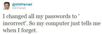
"Through 20 years of effort, we've successfully trained everyone to use passwords that are hard for humans to remember, but easy for computers to guess."
This is because password length matters so much that a random string of English words is actually more secure than a shorter password that follows the stupid rules of containing at least one number and one upper-case letter.

Either way, think you've got a secure password to your online accounts? Think again..
Data locks out the rest of the Enterprise crew by imitating Picard, and entering the ACCESS CODE FROM HELL!
A Facebook Prototype
Australian-based-but-Swedish Interactive Art Director Fred Nerby has created this short but rather interesting video that proposes a new conceptual approach to Facebook's page layout. In terms of look and feel it does borrow quite heavily from the tiled interaction of the Nokia Lumia, and the branding does overlap a little. However, I really like the magnifying glass and overlay panel approach when viewing comments so that the user remains on the main page, and the split screen double scrolling panels is an interesting touch, but is it scalable? Also, the large profile images that look like they were taken on a modelling shoot might not be for everyone (it would be interesting to see what happens if users were encouraged to replace small avatar images with large glossy ones).
What this video really needs though is to placed in a contextual screen so that the viewer can see how this layout scales across platform (from desktop to tablet to mobile). It will be interesting to see if a Facebook spokesperson comments on this video as this new page layout and the sliding panel interaction all looks very similar to the new MySpace which was relaunched in December 2012.
What this video really needs though is to placed in a contextual screen so that the viewer can see how this layout scales across platform (from desktop to tablet to mobile). It will be interesting to see if a Facebook spokesperson comments on this video as this new page layout and the sliding panel interaction all looks very similar to the new MySpace which was relaunched in December 2012.
Facebook Prototype - Conceptional Approach from Fred Nerby on Vimeo.
Connecting
Excellent documentary on how the relationship with digital devices and human interaction is merging to the point that our devices fade into the background and enable the user rather than interrupt them. Interaction design is now about providing a platform for the user to mould and shape into something they find useful.
The 18 minute "Connecting" documentary is an exploration of the future of Interaction Design and User Experience from some of the industry's thought leaders. As the role of software is catapulting forward, Interaction Design is seen to be not only increasing in importance dramatically, but also expected to play a leading role in shaping the coming "Internet of things." Ultimately, when the digital and physical worlds become one, humans along with technology are potentially on the path to becoming a "super organism" capable of influencing and enabling a broad spectrum of new behaviors in the world.
The 18 minute "Connecting" documentary is an exploration of the future of Interaction Design and User Experience from some of the industry's thought leaders. As the role of software is catapulting forward, Interaction Design is seen to be not only increasing in importance dramatically, but also expected to play a leading role in shaping the coming "Internet of things." Ultimately, when the digital and physical worlds become one, humans along with technology are potentially on the path to becoming a "super organism" capable of influencing and enabling a broad spectrum of new behaviors in the world.
Subscribe to:
Posts (Atom)