
Showing posts with label usability. Show all posts
Showing posts with label usability. Show all posts
Foot buttons
Not sure where this is, but this lift / elevator has foot buttons for each floor! Awesome.

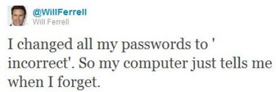
Too many passwords!
When a website forces me to use upper case, lower case, numbers, and symbols in my password...

via 9gag
Youtube user experience fails
In this fantastic video from YouTube user NanoBite, titled YouTube is a Completely Functional Site Programmed by Competent People, the latest interface design is picked apart and revealed to show some pretty fundamental flaws in the user experience design.
What's great about this video is that it runs like the highlights reel from a usability testing session and shows you exactly the type of thing that happens when those that build an online service get so comfortable with using it that they forget to think of their users who may not know all the intricacies of the design.
What's great about this video is that it runs like the highlights reel from a usability testing session and shows you exactly the type of thing that happens when those that build an online service get so comfortable with using it that they forget to think of their users who may not know all the intricacies of the design.
The BMW sound designers
How do you enhance the driving experience of a popular car brand in a highly competitive market? By considering an often overlooked but integral element of the user experience, the sound design of the product.
At BMW it has become such an exact science that 14 sound artists work on creating sounds that are functional and yet pleasent to the ear.
As one of the sound artists says, "a car needs the right soundtrack for maximum driving pleasure" and he's got a point - not only do the sounds a car makes need to be of a high quality, but also the unwanted sounds need to be removed. I've often thought this after stepping out of a nice car and enjoying the clunk of the door closing - automotive sound design is very similar to user experience design for the web in the sense that if it's done right then it's pleasantly ambient.
Automated Telephone Menus
If you have ever had the misfortune of encountering an automated telephone menu then you will already know exactly how terrible the user experience is on these things.
If you haven't here's how they work: rather than talking to a real person you are played a recording of a person introducing the service you have just called up (the recording has been edited and compressed so much that it sounds like a robot voice). The user is expected to select their options by timing their response precisely and pitched perfectly. The voice recognition software is often incredibly flawed at best, and the resulting user experience is enough to put you off ever
This brilliant recording demonstrates just how frustrating automated telephone menus can be:
A fantastic parody of an automated telephone menu is here by the Fonejacker:
The access code from hell
Creating yet another password for yet another new website is already a years old problem. Most people tend to go for the less secure option which is either numerical variants on the same password, or just stick with the same one for several similar websites. We've all got our own methods, and since it's not something that is taught to users, it is learnt organically and by trial and error.
"Through 20 years of effort, we've successfully trained everyone to use passwords that are hard for humans to remember, but easy for computers to guess."
This is because password length matters so much that a random string of English words is actually more secure than a shorter password that follows the stupid rules of containing at least one number and one upper-case letter.

Either way, think you've got a secure password to your online accounts? Think again..
Data locks out the rest of the Enterprise crew by imitating Picard, and entering the ACCESS CODE FROM HELL!
A Facebook Prototype
Australian-based-but-Swedish Interactive Art Director Fred Nerby has created this short but rather interesting video that proposes a new conceptual approach to Facebook's page layout. In terms of look and feel it does borrow quite heavily from the tiled interaction of the Nokia Lumia, and the branding does overlap a little. However, I really like the magnifying glass and overlay panel approach when viewing comments so that the user remains on the main page, and the split screen double scrolling panels is an interesting touch, but is it scalable? Also, the large profile images that look like they were taken on a modelling shoot might not be for everyone (it would be interesting to see what happens if users were encouraged to replace small avatar images with large glossy ones).
What this video really needs though is to placed in a contextual screen so that the viewer can see how this layout scales across platform (from desktop to tablet to mobile). It will be interesting to see if a Facebook spokesperson comments on this video as this new page layout and the sliding panel interaction all looks very similar to the new MySpace which was relaunched in December 2012.
What this video really needs though is to placed in a contextual screen so that the viewer can see how this layout scales across platform (from desktop to tablet to mobile). It will be interesting to see if a Facebook spokesperson comments on this video as this new page layout and the sliding panel interaction all looks very similar to the new MySpace which was relaunched in December 2012.
Facebook Prototype - Conceptional Approach from Fred Nerby on Vimeo.
Connecting
Excellent documentary on how the relationship with digital devices and human interaction is merging to the point that our devices fade into the background and enable the user rather than interrupt them. Interaction design is now about providing a platform for the user to mould and shape into something they find useful.
The 18 minute "Connecting" documentary is an exploration of the future of Interaction Design and User Experience from some of the industry's thought leaders. As the role of software is catapulting forward, Interaction Design is seen to be not only increasing in importance dramatically, but also expected to play a leading role in shaping the coming "Internet of things." Ultimately, when the digital and physical worlds become one, humans along with technology are potentially on the path to becoming a "super organism" capable of influencing and enabling a broad spectrum of new behaviors in the world.
The 18 minute "Connecting" documentary is an exploration of the future of Interaction Design and User Experience from some of the industry's thought leaders. As the role of software is catapulting forward, Interaction Design is seen to be not only increasing in importance dramatically, but also expected to play a leading role in shaping the coming "Internet of things." Ultimately, when the digital and physical worlds become one, humans along with technology are potentially on the path to becoming a "super organism" capable of influencing and enabling a broad spectrum of new behaviors in the world.
How Bad Online Shopping Experiences Look Like In Real Life
Google Analytics has produced a trio of excellent videos to help E-commerce sites improve their customer service by pointing out what not to do.
By putting the common mistakes and bad practices that online merchants make into a real life shop, the videos show how alienating bad user experience design and marketing can be for potential customers by ruining the experience of shopping online.
For instance, one of the videos highlights how frustrating it can be to check out online when there are too many security measures and hidden costs for customers to get through.
via Google Analytics
Getting to know Windows 8
With the launch of Windows 8 also comes two very interesting "usability testing" videos.
The first is from the New York Times and features some very heavy handed facilitation of the testing sessions (check it out at 22 seconds in where the facilitator is clearly telling the participant what to click on. Obviously, lurking behind the participant, pointing at things to click on, and generally leading the user is not a good way of gathering useful insights about a new interface. As a promotional piece, the video is great but some of the techniques used in the sessions made me laugh.
The New York Times invited five computer users to try their hands at navigating Microsoft’s new tablet-friendly redesign.
Next up is a bizarre piece of video from Three Sheets Research which looks at how users handle new interfaces when drunk.
This video is part of a set of web usability tests, focused on drinking customers, conducted by Three Sheets Market Research. Following the release of Windows 8, we wasted no time in trying out Microsoft's new operating system on a drunken subject. Jennifer, a 40-year-old mother of 2, is an active consumer of PCs, software and alcohol. She agreed to sit down with us the afternoon following the product's launch to share her thoughts on Windows 8, all while imbibing several rounds of her favorite tequila.
The first impressions of a new interface are crucial and the subtle hints provided by the user experience are designed to ease the user in by introducing the fundamental interactions and then building the experience up around them. Providing users with prompts should only be done if the task they are carrying out has been totally failed and there are no new insights being captured. Also, introducing a user to a new interface when they're drunk is totally useless as they might as well start again when sober.
Any new operating system will be difficult for a first time user, whether drunk, sober or just a bit slow. It is possible Jennifer will eventually learn how to use the software. But it is doubtful that, even the morning after, she'll ever fully recover from her initial impression of Windows 8 as confusing and unwelcoming.
Think about a time when you might have been drunk and first turned on a new mobile phone, played a new video game, or tried to buy a ticket from a ticket machine that you'd not used before. Unless you were incredibly persistant the experience will have been written off and you would have mentally started afresh the next day. The initial experience is considered null and any negative impressions should be considered alongside the fact that you weren't in "learning mode". Unless of course, the interface was designed to be used whilst drunk as is the case with SingStar which was usability tested on groups of drunk people before launch to see if it was simple enough to use after an night out - which was the exact scenario that Sony Computer Entertainment wanted their users to be in..
Usability testing with DMX
"What is a Google?" asks rapper DMX as he is gently introduced to the web on a laptop.
Ford Keyfree Login
Get rid of the problem of remembering all your different passwords with Ford's Keyfree login software. Great concept - place your smartphone near your computer to automatically log in to your accounts.
Ford Keyfree Login from Ogilvy Paris on Vimeo.
Dynamic Physical Buttons on Touch Screens : Tactus Technology
World's first dynamic deformable tactile surface capable of creating dynamic physical buttons that users can actually see and feel in advance of entering data into the device.
Out of the box Samsung
This is a great idea! "Out of the Box" is a friendly user manual for Samsung smart phones by Vitamins Design London, Royal College of Arts Helen Hamyln Center and Samsung Design Europe.
Behind the Screen Overlay Interactions
Behind the Screen Overlay Interactions: Behind-the-screen interaction with a transparent OLED with view-dependent, depth-corrected gaze.
A project by Jinha Lee and Cati Boulanger, former intern and researcher respectively, at Microsoft Applied Sciences would change all that. They’re using a special transparent OLED screen from Samsung and a series of sensors, along with custom software that reshuffles the keyboard to the back of the screen. So you can work with your hands inside the virtual desktop.

Dark Patterns: User Interfaces Designed to Trick People
Normally when you think of "bad design", you think of laziness or mistakes. These are known as design anti-patterns. Dark Patterns are different – they are not mistakes, they are carefully crafted with a solid understanding of human psychology, and they do not have the user’s interests in mind.
Read more over at Dark Patterns
Dark Patterns: User Interfaces Designed to Trick People (Presented at UX Brighton 2010)
View another webinar from Harry Brignull
Read more over at Dark Patterns
Subscribe to:
Posts (Atom)