
Showing posts with label layout. Show all posts
Showing posts with label layout. Show all posts
Foot buttons
Not sure where this is, but this lift / elevator has foot buttons for each floor! Awesome.

Evolution of the desktop
The history of the working desk in one neat little animated gif. Harvard Innovation Lab used real vintage items to create this evolution of the desk over the past 35 years in one short timelapse.


Responsive design

Funny pic. But it does raise a relevant question; how many devices do you test your website out on?
The short answer is 3: mobile, tablet, and desktop. Go for 320px, 768px, 1024px and adjust screen size by percentage for a fluid responsive layout.
But, if you're a company like The New York Times or Wordpress, then you'll be testing your service across every device out there.

'Case study' on improving factory efficiency

This is the story of the toothpaste factory that had a problem detecting empty toothpaste boxes at the end of the assembly line.
Understanding how important that was, the CEO of the toothpaste factory got the top people in the company together and they decided to start a new project, in which they would hire an external engineering company to solve their empty boxes problem, as their engineering department was already too stretched to take on any extra effort.
The project followed the usual process: budget and project sponsor allocated, RFP, third-parties selected, and six months (and $8 million) later they had a fantastic solution — on time, on budget, high quality and everyone in the project had a great time. They solved the problem by using some high-tech precision scales that would sound a bell and flash lights whenever a toothpaste box weighing less than it should. The line would stop, and someone had to walk over and yank the defective box out of it, pressing another button when done.
A while later, the CEO decides to have a look at the ROI of the project: amazing results! No empty boxes ever shipped out of the factory after the scales were put in place. Very few customer complaints, and they were gaining market share. “That’s some money well spent!” – he says, before looking closely at the other statistics in the report.
It turns out, the number of defects picked up by the scales was 0 after three weeks of production use. It should’ve been picking up at least a dozen a day, so maybe there was something wrong with the report. He filed a bug against it, and after some investigation, the engineers come back saying the report was actually correct. The scales really weren’t picking up any defects, because all boxes that got to that point in the conveyor belt were good.
Puzzled, the CEO travels down to the factory, and walks up to the part of the line where the precision scales were installed. A few feet before it, there was a $20 desk fan, blowing the empty boxes out of the belt and into a bin.
“Oh, that — one of the guys put it there ’cause he was tired of walking over every time the bell rang”, says one of the workers.
Regardless of whether it's just a made-up story or not, it's still a good way to look at things. Sometimes the solution is easier than expected.
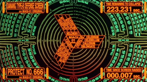
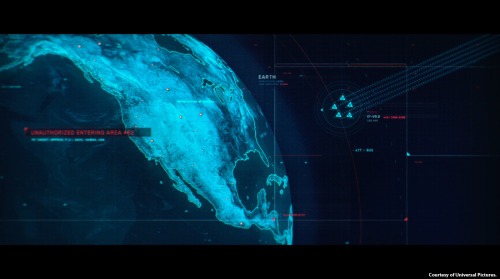
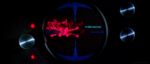
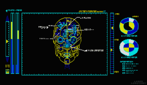
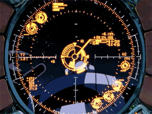
Futuristic GUI
Now, I have to admit I have have something of a penchant for sci-fi movies and always become distracted the plot and often jealous of the cool interfaces the characters in these movies get to use. So you'll understand that I was pretty excited when I stumbled across a tumblr created by a Czech person (I don't know who they are, very mysterious) who shares this interest in futuristic graphical user interfaces and has gone through the trouble of collecting the best examples and turning them into gifs. I've shown my favourites from the collection below:


Check out the whole of this awesome collection over at Visual Punker
Check out the whole of this awesome collection over at Visual Punker
Automated Storytelling
We live in the era of Big Data. Never in modern human history have companies and individuals had more (and more complex and reliable) numbers, statistics, and metrics at their disposal: from box scores to earnings reports to housing prices to placement-test results, we are at sea in an ocean of numbers and awash in spreadsheets. As artificial-intelligence pioneer Kris Hammond explains in this film, the great challenge in the Big Data era is understanding the stories those numbers tell and, just as important, connecting the right people with the right stories.
“This is what Hammond and his company, Narrative Science, do: create fluidly written, micro-targeted news stories from massive amounts of raw data—and do it hundreds of thousands of times, and slightly differently for each reader or listener. The recipient could be a fast-food franchisee seeking to understand what menu item sells best at what moment of the day, at what time of year, even in what weather, so he can optimize point-of-sale strategies. “
“Our entire job,” says Hammond, “is to humanize data. It is to be a communication bridge between the numbers and the knowing.”
Read more on the Future of Storytelling.
Globaia - The Anthropocene
The Anthropocene = "A period marked by a regime change in the activity of industrial societies which began at the turn of the nineteenth century and which has caused global disruptions in the Earth System on a scale unprecedented in human history: climate change, biodiversity loss, pollution of the sea, land and air, resources depredation, land cover denudation, radical transformation of the ecumene, among others. These changes command a major realignment of our consciousness and worldviews, and call for different ways to inhabit the Earth."

This video is an illustration of map experiments that demonstrate the Anthtopocene, and it shows several features of our global civilization: cities, built environment, transmission lines, pipelines, main paved and unpaved roads and railways.
This is essentially really intense mapping, but once you've got your head around the rather weighty text introduction (after the link), the true scale and meaning behind it will blow your mind.
via Globaia
A Facebook Prototype
Australian-based-but-Swedish Interactive Art Director Fred Nerby has created this short but rather interesting video that proposes a new conceptual approach to Facebook's page layout. In terms of look and feel it does borrow quite heavily from the tiled interaction of the Nokia Lumia, and the branding does overlap a little. However, I really like the magnifying glass and overlay panel approach when viewing comments so that the user remains on the main page, and the split screen double scrolling panels is an interesting touch, but is it scalable? Also, the large profile images that look like they were taken on a modelling shoot might not be for everyone (it would be interesting to see what happens if users were encouraged to replace small avatar images with large glossy ones).
What this video really needs though is to placed in a contextual screen so that the viewer can see how this layout scales across platform (from desktop to tablet to mobile). It will be interesting to see if a Facebook spokesperson comments on this video as this new page layout and the sliding panel interaction all looks very similar to the new MySpace which was relaunched in December 2012.
What this video really needs though is to placed in a contextual screen so that the viewer can see how this layout scales across platform (from desktop to tablet to mobile). It will be interesting to see if a Facebook spokesperson comments on this video as this new page layout and the sliding panel interaction all looks very similar to the new MySpace which was relaunched in December 2012.
Facebook Prototype - Conceptional Approach from Fred Nerby on Vimeo.
OrgOrgChart – the evolution of a company’s structure over time, visualized.
The OrgOrgChart (Organic Organization Chart) project looks at the evolution of a company's structure over time. A snapshot of the Autodesk organizational hierarchy was taken each day between May 2007 and June 2011, a span of 1498 days.
Each day the entire hierarchy of the company is constructed as a tree with each employee represented by a circle, and a line connecting each employee with his or her manager. Larger circles represent managers with more employees working under them. The tree is then laid out using a force-directed layout algorithm.
From day to day, there are three types of changes that are possible:
- Employees join the company
- Employees leave the company
- Employees change managers
Read more here
How long different animals live, in vintage ISOTYPE infographic. Austrian sociologist, philosopher, and curator Otto Neurath, who was born 130 years ago today, and his wife Marie pioneered the International System Of TYpographic Picture Education in the 1930s, laying the foundation for modern infographics.
via the incredible Brain Pickings

via the incredible Brain Pickings
Getting to know Windows 8
With the launch of Windows 8 also comes two very interesting "usability testing" videos.
The first is from the New York Times and features some very heavy handed facilitation of the testing sessions (check it out at 22 seconds in where the facilitator is clearly telling the participant what to click on. Obviously, lurking behind the participant, pointing at things to click on, and generally leading the user is not a good way of gathering useful insights about a new interface. As a promotional piece, the video is great but some of the techniques used in the sessions made me laugh.
The New York Times invited five computer users to try their hands at navigating Microsoft’s new tablet-friendly redesign.
Next up is a bizarre piece of video from Three Sheets Research which looks at how users handle new interfaces when drunk.
This video is part of a set of web usability tests, focused on drinking customers, conducted by Three Sheets Market Research. Following the release of Windows 8, we wasted no time in trying out Microsoft's new operating system on a drunken subject. Jennifer, a 40-year-old mother of 2, is an active consumer of PCs, software and alcohol. She agreed to sit down with us the afternoon following the product's launch to share her thoughts on Windows 8, all while imbibing several rounds of her favorite tequila.
The first impressions of a new interface are crucial and the subtle hints provided by the user experience are designed to ease the user in by introducing the fundamental interactions and then building the experience up around them. Providing users with prompts should only be done if the task they are carrying out has been totally failed and there are no new insights being captured. Also, introducing a user to a new interface when they're drunk is totally useless as they might as well start again when sober.
Any new operating system will be difficult for a first time user, whether drunk, sober or just a bit slow. It is possible Jennifer will eventually learn how to use the software. But it is doubtful that, even the morning after, she'll ever fully recover from her initial impression of Windows 8 as confusing and unwelcoming.
Think about a time when you might have been drunk and first turned on a new mobile phone, played a new video game, or tried to buy a ticket from a ticket machine that you'd not used before. Unless you were incredibly persistant the experience will have been written off and you would have mentally started afresh the next day. The initial experience is considered null and any negative impressions should be considered alongside the fact that you weren't in "learning mode". Unless of course, the interface was designed to be used whilst drunk as is the case with SingStar which was usability tested on groups of drunk people before launch to see if it was simple enough to use after an night out - which was the exact scenario that Sony Computer Entertainment wanted their users to be in..
SimCity
This gameplay video for the new SimCity game has gotten me really excited. As a big fan of the initial series, this video shows how much cooler the simulation of running a city can look with the added layer of sick graphics over the top of a realistic gameplay model.
Ultimately you can do whatever you want, focus on growing your population, increasing wealth or even build a city that looks like your hometown. Whatever your motivation, you have to the power to experiment with a number of different strategies.
How you choose to play will influence your city, the neighbouring cities and the lives of all the Sims across the region.
Digital library in Bucharest metro station
This is an idea that has been seen on the Bucharest metro - as you wait for your train use your mobile to scan a book from the bookcase printed on the walls and then you'll have something to read on your journey. Fantastic!

via Reddit

via Reddit
Behind the Screen Overlay Interactions
Behind the Screen Overlay Interactions: Behind-the-screen interaction with a transparent OLED with view-dependent, depth-corrected gaze.
A project by Jinha Lee and Cati Boulanger, former intern and researcher respectively, at Microsoft Applied Sciences would change all that. They’re using a special transparent OLED screen from Samsung and a series of sensors, along with custom software that reshuffles the keyboard to the back of the screen. So you can work with your hands inside the virtual desktop.

Dark Patterns: User Interfaces Designed to Trick People
Normally when you think of "bad design", you think of laziness or mistakes. These are known as design anti-patterns. Dark Patterns are different – they are not mistakes, they are carefully crafted with a solid understanding of human psychology, and they do not have the user’s interests in mind.
Read more over at Dark Patterns
Dark Patterns: User Interfaces Designed to Trick People (Presented at UX Brighton 2010)
View another webinar from Harry Brignull
Read more over at Dark Patterns
Immersive Movie Experience
Impressive use of 3D projection mapping - no SFX, post production, or cuts, this was all done in one take.
In the past, projection mapping worked only from a single, static view point, and thus was very limited. By attaching the PlayStation Move to the camera, projections can be tracked to screens in real time, enhancing the effect of spatial deformation and false perspective on the projections and allowing viewers to look round (virtual) corners, bend walls, create a hole in the wall, or remove the walls altogether to reveal vast expanses of virtual worlds.
Subscribe to:
Posts (Atom)