Excellent map animation from Oliver O’Brien that visualises the touch ins and outs of Oyster cards, London's travel cards. Originally created for the “Sense and the City” exhibition at the London Transport Museum, which ran from Summer 2011 to Spring 2012, this animation powerfully illustrates the flow of London's population towards its centre as people commute in to work.
The in/out numbers are for each 10-minute interval. For stations where the in/out numbers are roughly equal at that time, the colour is white. Red stations indicate a strong flow into the network and green stations show a predominately outward flow. The Oyster card data was supplied by Transport for London and a version of this animation was created and shown at the London Transport Museum during its "Sense and the City" exhibition in 2011/2. The video here is a screen capture of a OpenLayers map which was produced by me at UCL CASA for the exhibition. The background map is based on data from Ordnance Survey Open Data (Crown Copyright) and OpenStreetMap contributors (ODbL). Background imagery created using Mapnik.


UX is not UI
Interesting 'infographic' from Erik Flowers on the common misconception that being classed as a User Experience Designer can be incorrectly understood as someone who focusses just on user interface design. The interface is not the solution and a good user experience does not stem directly from a good user interface, there are many more factors involved (as illustrated below).


Globaia - The Anthropocene
The Anthropocene = "A period marked by a regime change in the activity of industrial societies which began at the turn of the nineteenth century and which has caused global disruptions in the Earth System on a scale unprecedented in human history: climate change, biodiversity loss, pollution of the sea, land and air, resources depredation, land cover denudation, radical transformation of the ecumene, among others. These changes command a major realignment of our consciousness and worldviews, and call for different ways to inhabit the Earth."

This video is an illustration of map experiments that demonstrate the Anthtopocene, and it shows several features of our global civilization: cities, built environment, transmission lines, pipelines, main paved and unpaved roads and railways.
This is essentially really intense mapping, but once you've got your head around the rather weighty text introduction (after the link), the true scale and meaning behind it will blow your mind.
via Globaia

This video is an illustration of map experiments that demonstrate the Anthtopocene, and it shows several features of our global civilization: cities, built environment, transmission lines, pipelines, main paved and unpaved roads and railways.
This is essentially really intense mapping, but once you've got your head around the rather weighty text introduction (after the link), the true scale and meaning behind it will blow your mind.
via Globaia
Automated Telephone Menus
If you have ever had the misfortune of encountering an automated telephone menu then you will already know exactly how terrible the user experience is on these things.
If you haven't here's how they work: rather than talking to a real person you are played a recording of a person introducing the service you have just called up (the recording has been edited and compressed so much that it sounds like a robot voice). The user is expected to select their options by timing their response precisely and pitched perfectly. The voice recognition software is often incredibly flawed at best, and the resulting user experience is enough to put you off ever
This brilliant recording demonstrates just how frustrating automated telephone menus can be:
A fantastic parody of an automated telephone menu is here by the Fonejacker:
If you haven't here's how they work: rather than talking to a real person you are played a recording of a person introducing the service you have just called up (the recording has been edited and compressed so much that it sounds like a robot voice). The user is expected to select their options by timing their response precisely and pitched perfectly. The voice recognition software is often incredibly flawed at best, and the resulting user experience is enough to put you off ever
This brilliant recording demonstrates just how frustrating automated telephone menus can be:
A fantastic parody of an automated telephone menu is here by the Fonejacker:
The access code from hell
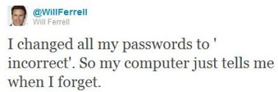
Creating yet another password for yet another new website is already a years old problem. Most people tend to go for the less secure option which is either numerical variants on the same password, or just stick with the same one for several similar websites. We've all got our own methods, and since it's not something that is taught to users, it is learnt organically and by trial and error.
"Through 20 years of effort, we've successfully trained everyone to use passwords that are hard for humans to remember, but easy for computers to guess."
This is because password length matters so much that a random string of English words is actually more secure than a shorter password that follows the stupid rules of containing at least one number and one upper-case letter.

Either way, think you've got a secure password to your online accounts? Think again..
Data locks out the rest of the Enterprise crew by imitating Picard, and entering the ACCESS CODE FROM HELL!

"Through 20 years of effort, we've successfully trained everyone to use passwords that are hard for humans to remember, but easy for computers to guess."
This is because password length matters so much that a random string of English words is actually more secure than a shorter password that follows the stupid rules of containing at least one number and one upper-case letter.

Either way, think you've got a secure password to your online accounts? Think again..
Data locks out the rest of the Enterprise crew by imitating Picard, and entering the ACCESS CODE FROM HELL!
Subscribe to:
Posts (Atom)